Armut Customer Portal

Armut (internationally known as Homerun) is the leading marketplace for professional services in Middle East and Eastern Europe. It is an online platform connecting professionals offering a variety of services —from cleaning to teaching, to renovations, to wedding organization and many more— with the people who are in need of these services.

I joined the company in 2014 as a jack of all trades, when the product team consisted of only 4 people. Today Armut/Homerun has more than 100 employees and serves 8 countries. In the beginning I was doing product design, marketing and frontend development. With time my role evolved to leading the design team, managing a shared design system, running user research.

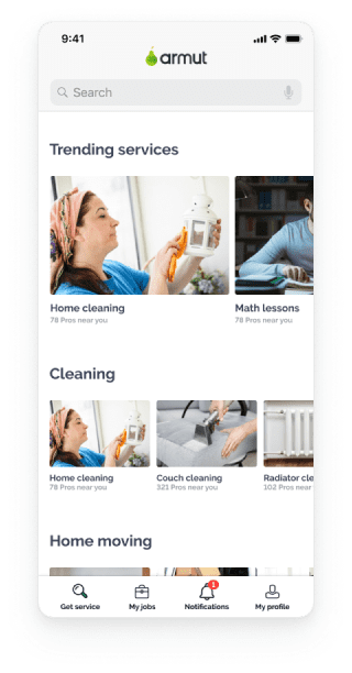
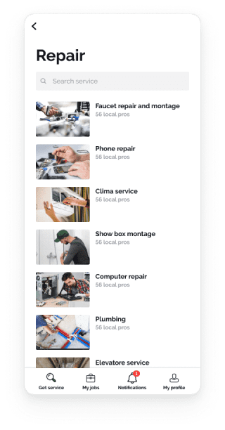
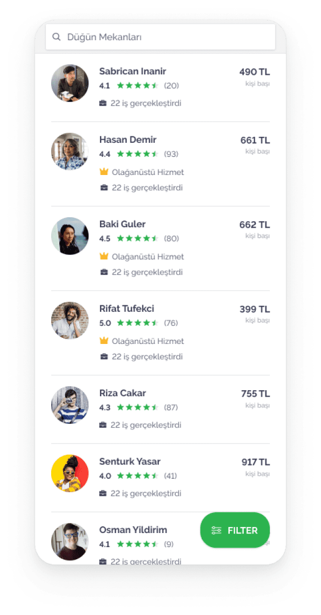
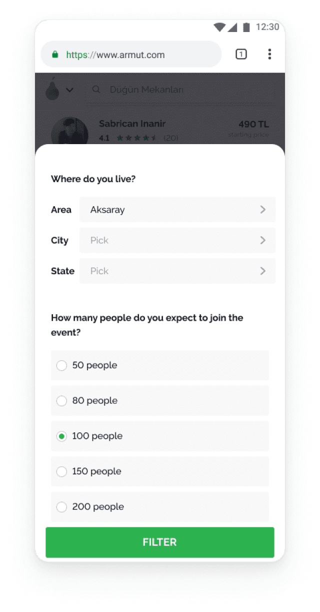
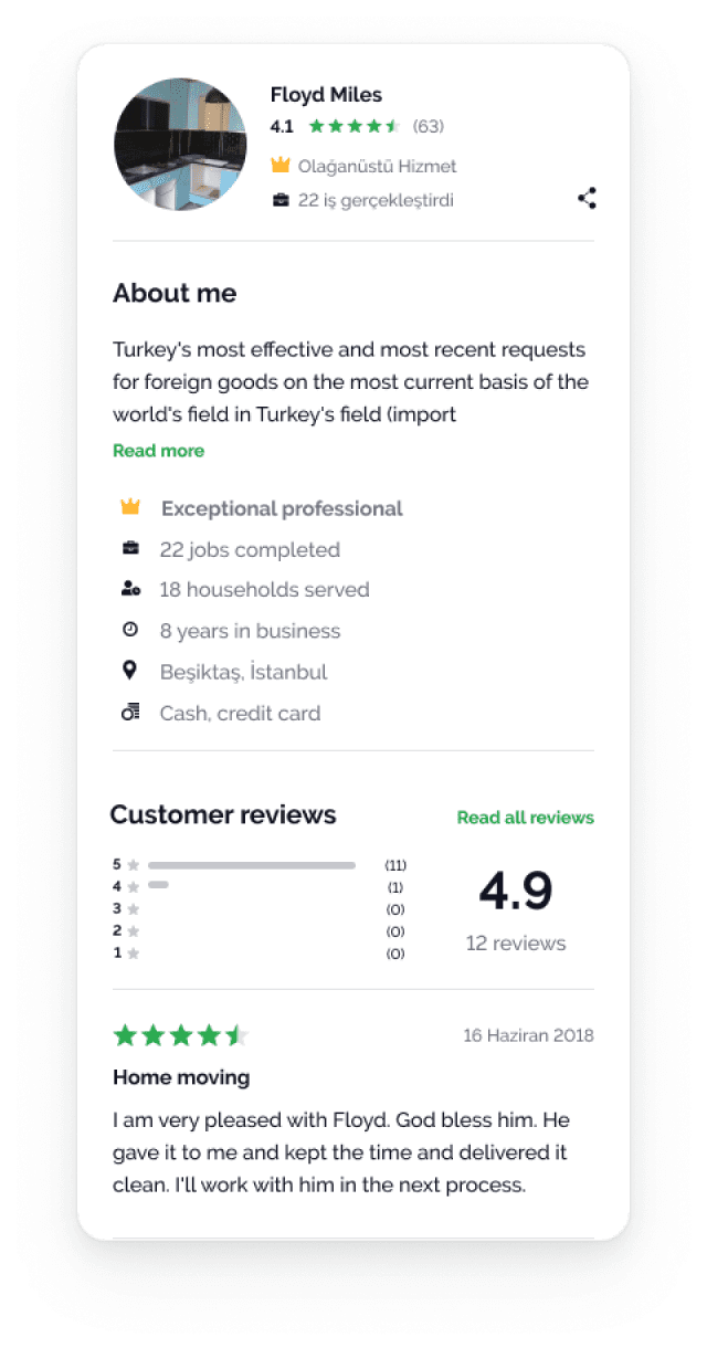
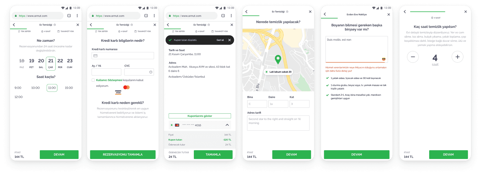
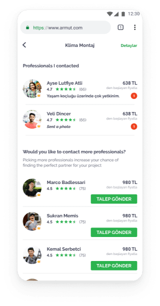
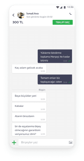
Like all marketplaces Armut/Homerun has two user categories. On one side there are Professionals, who join the platform to extend their reach and find new job opportunities. On the other side are Customers, who are looking for a trusted and capable professional to hire. This division create a dualism in the design principles that we apply to our interfaces. Generally professionals are hardcore users who open our app many times a day and care about efficiency and variety of tools. Customers are casual users that depend on familiar UX patterns and clear funnels to navigate toward their goal.

Service discovery

The discovery experience on the platform is tailored to onboard users in a quick and simple way. Page content and information architecture is sligthly different between new and returning users.

New users are showed value propositions, a more prominent “work with us” section and a more synthethic content discovery section. Returning users are instead offered a selection of suggested service picked by a machine learning engine.

Pro discovery

The user experience on Armut differs from service to service. Some services are served through direct booking, some through a “browse professionals and contact them” and some through a “tell us what you need and you’ll receive some quotes”.

These diverse experiences are the result of a t-shaped approach: trying to serve as many customers as possible with a standard model while putting extra attention and resources in designing better business models for profitable categories.

The “browse&contact” model was born out of several needs: on one side Customers expect to see Professionals immediately after reaching the platform, while on the other side Professionals expect more valuable leads and commited Customers.

Job request process

The job request process is one of the most important part of the conversion funnel. Through these screens customers describe the job they need done. This process used to be a long form with several text inputs to fill, but was split into different steps to reduce the mental workload. This kind of partitioning allowed also to easily identify dropoff moments, and over time, target those screens with dedicated design solutions.

The content and structure of this flow varies from service to service, and in a product with 200+ different services it is important to have a shared language and flexible components that can serve different cases.

CUS/PRO interaction

Many of the services Armut provides require some back and forth between Customer and Professional before an agreement is reached. While we could build some process to enforce users to do this on the app, our research revealed that the grand majority of our Professionals prefer talking via phone or, as last resort, texting.

Because of this we designed the Customer/Professional interaction around a chat screen with a call feature. The list of open conversation features some suggested Professionals that users can quickly get in touch with in case they want more options before committing to their project.

Rate and review

After the job gets flagged as “completed” the Customer is asked to rate his experience with the professional and leave a short feedback that will help future users.
To address privacy concern reviews can be set as anonymous, and the Customer is presented with a preview of the way it will look like once published.

Data crunching, user interviews and competitor benchmarks

Every screen and feature of the app has been designed by starting with qualitative and quantitative analysis to highlight problems and spot opportunities. User interviews and the contintinuous stream of feedbacks coming from our operation team provide the first insights, which are then validated through data analysis.

Draft, design, explore

Once the problem was clearly defined I explored different solutions, seeking inspiration from elsewhere and co-designing with a range of different people.

The word of the game is variety, with a keen eye both on common patterns and delightful interactions.

Delivering structured UI

A core virtue in the field In the service providng is ability to inspire trust. At the end of the day finding a new plumber, painter or cleaning lady means opening the door of your home to a complete stranger. Because of this the imagery of Armut/Homerun focus on real life pictures, starring confident professionals, happy customers and, possibly, empathetic interactions between them. With an ever growing list of services to display, we needed some guidelines to help maintaining a consistent look and feel across the platform.